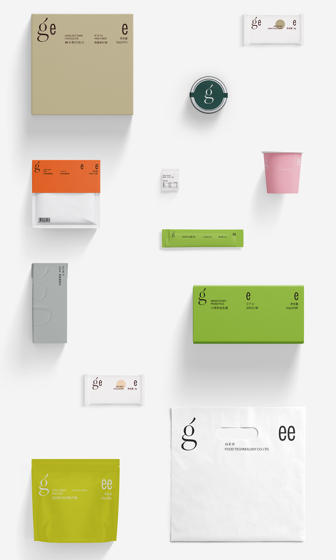
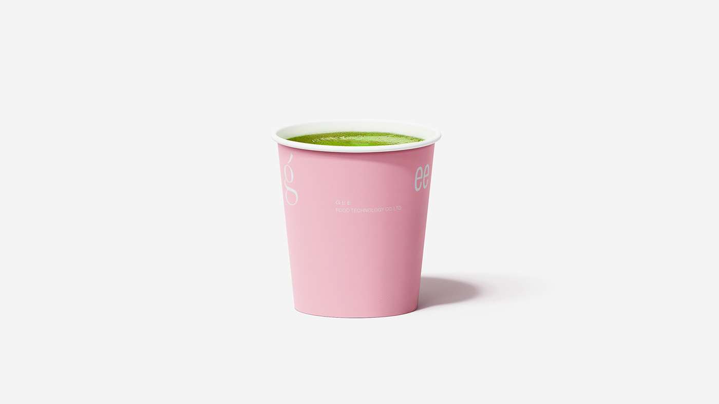
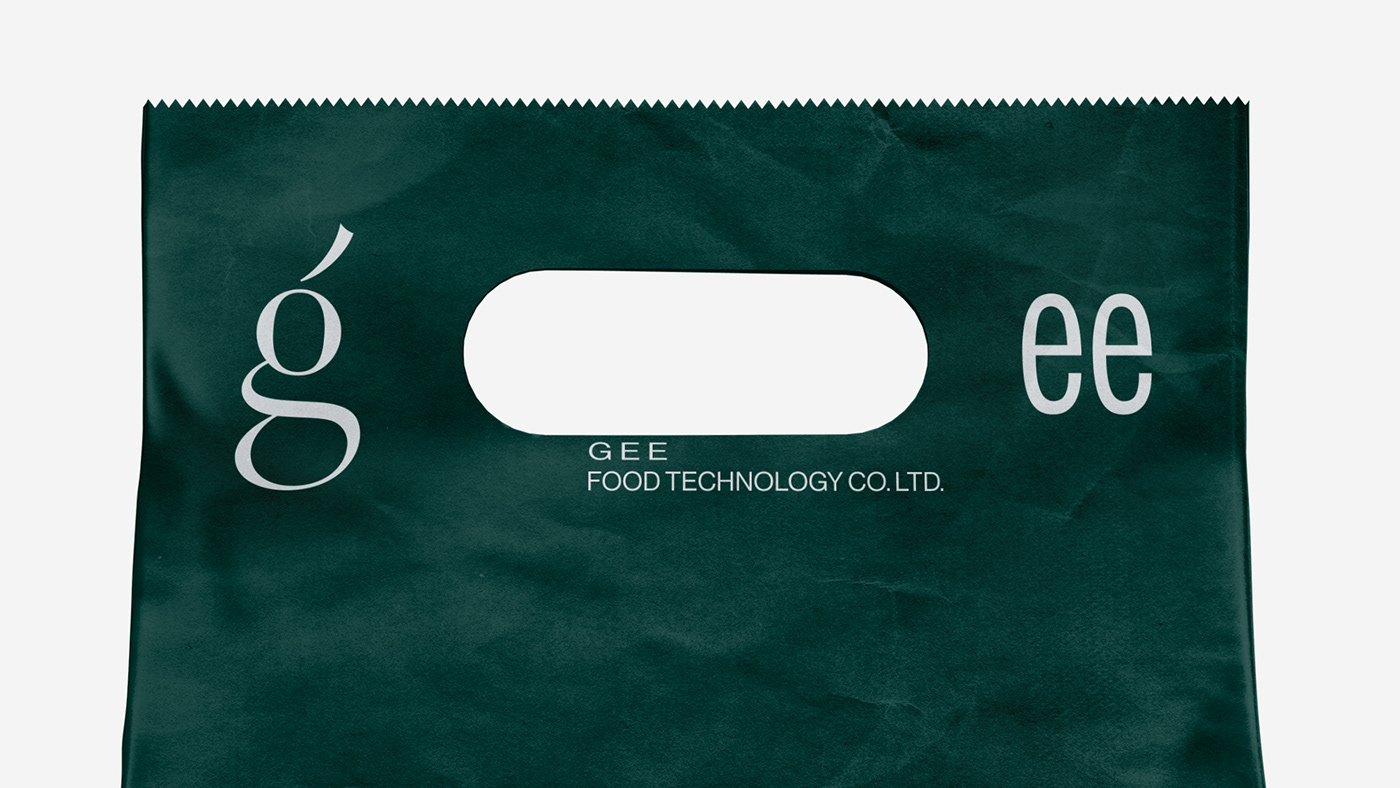
gee,主要针对当代年轻女性,借助现代科技研发出健康、营养且便携的食品。
标识强调最美字母“g”,整体融合了传统与现代的风格,做出严谨洽淡的比例及黑度处理,
延伸以排版为重点,传递轻盈,平衡,创新多元的品牌气质。
Gee, mainly for contemporary young women, has developed healthy, nutritious and portable food with the help of modern technology.
The logo emphasizes the most beautiful letter "g", which integrates the traditional and modern style, and makes a rigorous and fair proportion and blackness treatment,
The extension focuses on typesetting and conveys the brand temperament of lightness, balance, innovation and diversity.